

TRC is made up of MIT researchers and ride-share industry veterans, building smart, sustainable transit solutions that are more reliable and accessible than other mobility options. The brand is an on-demand vehicle routing and management platform that partners with cities to power the future of public transit.
THE ROUTING COMPANY


.png)
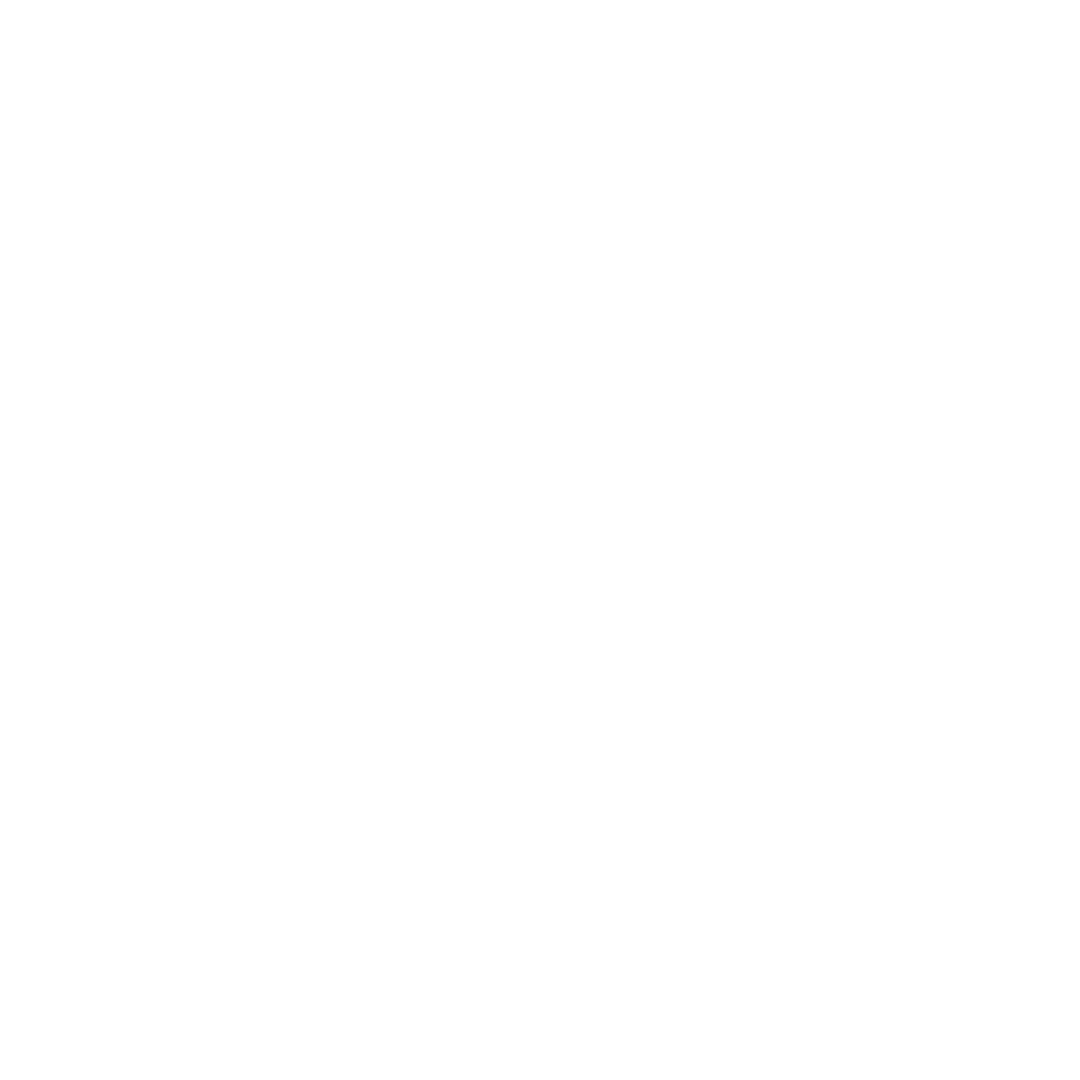
The logo is a letterform designed inspired by the different variations of the DIN 1451 font, internationally known and for a long time used in license plates, house numbers, and urban wayfinding signs. The highlight element is the cut in the letter openings, which is used as a construction base for the support line.
Influences

1.Building Blocks, Kumi Yamashita, Wall Art (2014).

2. Excerpt from Paula Scher's typographic maps painting, published in the homonymous book, subtitled MAPS, 2011.
To build a city
The concept smart: It's the best, now; It's the irreverent "cousin" of wise; It's related to the intellectual and cognitive capacity to read and solve the situation while in it. It's intelligent and creative while in the present moment. It's about thinking and living the city in a creative and constantly changing format, open to creation and curiosity.


_edited.png)


LIKE MAGIC
Both the line and the geometric shapes are graphic elements that accompany the logo. They reinforce the urban imagination and stimulate different possibilities of modular organization, referring to collective use and ownership.


DIGITAL EXPERIENCE
The translation from the physical to the digital universe happens very smoothly. From the website to the app icon, every touchpoint communicates the pleasurable simplicity that translated the brand's core.


SELECTED PROJECTS
